Follow us Now on Telegram ! Get daily 10 - 12 Interesting Updates. Join our Telegram Channel https://t.me/OhWomen
Download Telegram App before Joining the Channel
The colour of the year 2022 falls into a rich, luscious periwinkle blue shade, 'Very Peri', that seeps deep into the generous violet-like blend of blue and red. The oxymoron combination of warm and cool undertones sparks the colour into a fresh, flashy, futuristic vibe that is an ideal thrust for all the artistically crafted spaces we step into. The presence of Very Peri in architecture and interior design denotes transition, dynamism, and any other hint of newness that we all seek in a year like 2021.
In a personal space like an individual room, the vividness of very peri can be indulgently overplayed as a wall finishing, a hybrid of patterned wallpaper or textured paint, with freeform geometry or wild botanicals that further stimulate the dynamic persona of the color. Paired with daring complements like coral, parakeet, and fuchsia, "very peri" ponders into the feeling of "another world" with whimsical details and imaginative formulae.
The courage of the colour comes out the best when set free-it can be broken from the static by infusing dynamism into the regularities of life. Colour psychology shines in all its glory while reimagining statement pairs like consoles, side chairs, coffee tables, etc. in an organic or fluid silhouette with a prismatic play of colour gradients, texture assortments, and more. More eccentricity can be brought in with psychedelic art, Aztec patterns, ombre finishes, etc., which personify the metaverse details that have familiarised the mind over years through myths, stories, and media portrayal. Very Peri can paint the rooms in the colours of faith, hope, and divinity.
Carpe diem Loveseat and very peri blocks
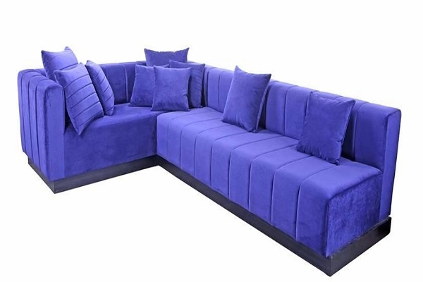
Taking on the other character, the richness of the colour can be expressed in extravagant textures of fabrics like velvet throw pillows, satin upholstered ottomans, embossed tapestries, and more "worked" pieces that have one of the two characters - they either talk about the craftsmanship of the artisan or boast about the exotic appeal of the handpicked premium fabric. The periwinkle hue, which is frequently seen in fur, suede, leather, and other high-end textiles, takes centre stage in the luxury range that reigns over the upholstery, from the largest of sofas to the smallest of poufs.
The virtual side of the power-driven shade can also be translated into industrially-styled pieces in the interior, such as metal partition frames, floating shelving, Memphis-inspired lamps and rugs, and more. The energy in the ambience can also be stepped up by a retro-futuristic character where white-washed backgrounds, fluid forms, sharp lighting, and a high intensity of lacquer get ready to conquer every nook of the interior. Accessories like vases, planters, artworks, throws and more draw creativity from the colour of the future with experimental forms, bold colour combinations, new-found material palettes and an exciting overall that strikes every interior element as an element of surprise and muse.
The multifaceted character of Very Peri opens up a canvas to explore and experiment in personal spaces. It follows no rules, no harmony. The use of colour is not a guide but a motivation to seek that which is out of the way-something that altogether lets us live our daydream in the real world.
Source - IANS